Glass
Simplifying Survey Data Exports at Glass
- Role
- Lead Product Designer
- Scope
- Research, information architecture, wireframes, prototyping, user testing
- Industry
- Market research, survey analytics, B2B SaaS
- Moved export tools out of cramped modals and into a primary product workspace.
- Created a three-panel structure for navigation, work, and contextual controls.
- Designed support for grouped banners, crosstabs, bulk editing, and templates.

Project Overview
Glass was a market research company serving large consumer brands such as JB Weld, Unilever, and Clorox. Its model combined expert consulting with a DIY survey platform, which made transparency and efficient data handling especially important.
The export workflow was a major point of friction. Researchers and clients needed to turn survey results into usable data, but the existing tools were hidden in modals, constrained by limited space, and hard to understand without prior expertise.
My task was to lead the redesign of the export tool so complex survey data could be configured, exported, and reused more efficiently.
The Challenge
The team needed to simplify a workflow with a lot of inherent complexity:
- Export options were difficult to discover and understand.
- Export status was not visible enough.
- Concepts like banners and crosstabs needed clearer explanation.
- Users needed more control over custom exports for different research goals.
- Modal-based UI made comparison, grouping, and advanced configuration harder than necessary.
Internal researchers were fast and comfortable with research terminology. External clients needed more guidance and clearer language. The redesign had to support both without slowing either group down.
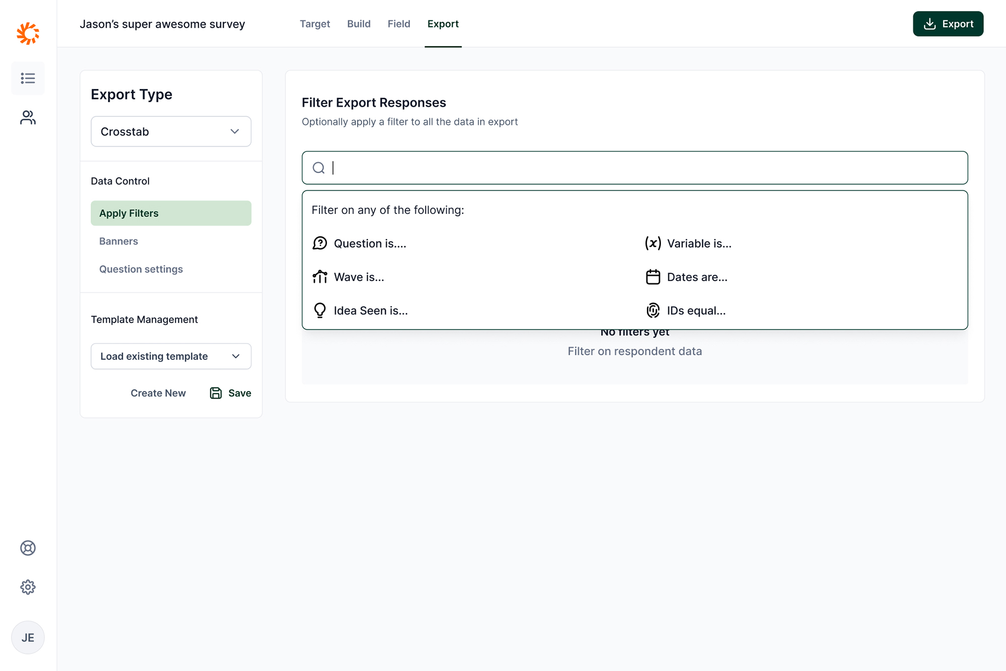 This omni-search allows researchers to filter on any type of data in the survey export. The suggestions help researchers contextually understand what options are available.
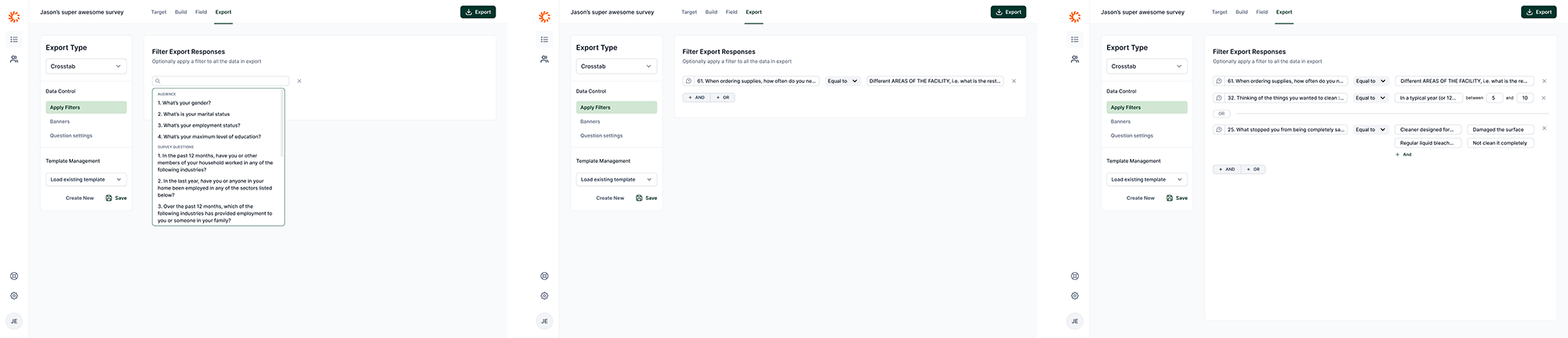 Example of various states of filtering an export.
Research And Insights
I interviewed internal researchers and external clients to understand where the current workflow broke down. The strongest insights were about confidence and context.
Internal researchers wanted speed. They already knew the terminology and needed the interface to help them move through repeat export work quickly.
External clients needed a more guided path. They were less familiar with banners, crosstabs, and how exported survey data would be used in analysis.
The core design problem was not just "make exports easier." It was to expose powerful controls in a way that matched how researchers actually reasoned about the exported data.
Ideation And Prototyping
I mapped the existing flows and pain points with the team, then explored a new information architecture that treated exports as a primary workspace rather than a modal task.
The strongest direction was a three-panel UI:
- Left panel: navigation through the export feature.
- Center panel: the main work area.
- Right panel: contextual settings and controls that could appear only when needed.
This structure gave the workflow more room while still keeping actions close to the user's current task. It also made it easier to explain advanced concepts in context instead of hiding help text or controls inside modal steps.
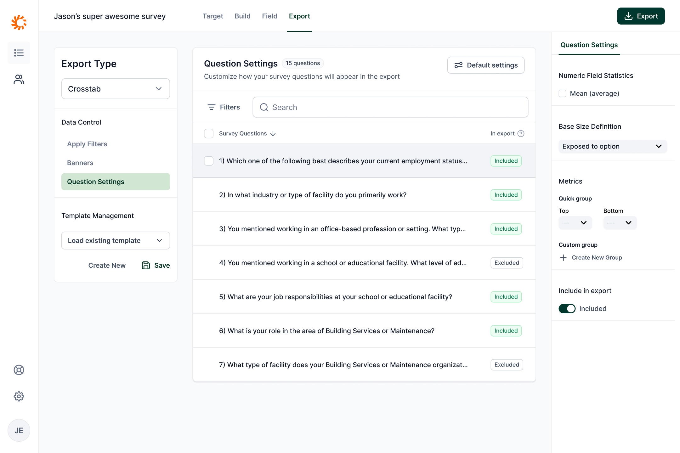 The researcher can also filter types of questions and make bulk decisions on those survey questions.
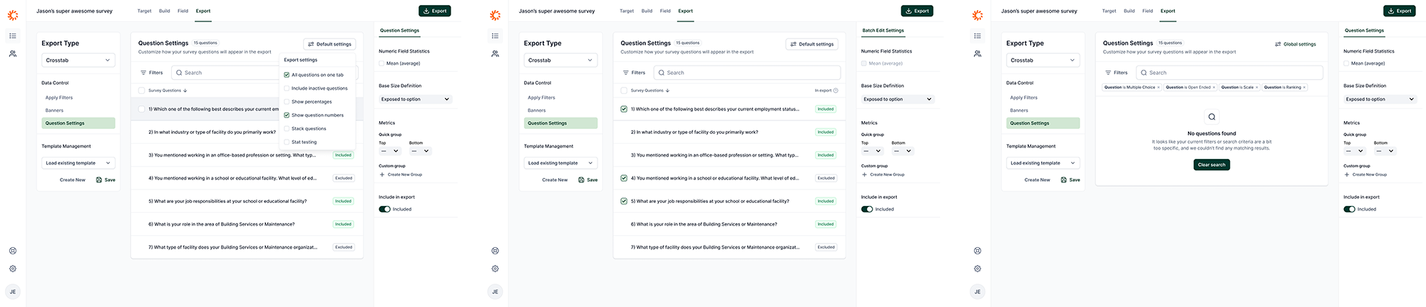 Example of various states of editing questions for an export.
Solution
The final design integrated exports into the main product UI. It gave users a dedicated place to configure and review exports, and it supported more advanced workflows such as:
- Grouping banners and crosstabs.
- Bulk editing.
- Creating and saving export templates.
- Toggling a read-only view to make configured exports easier to inspect.
The design gave internal researchers the speed they needed while creating a clearer path for external clients who needed more explanation.
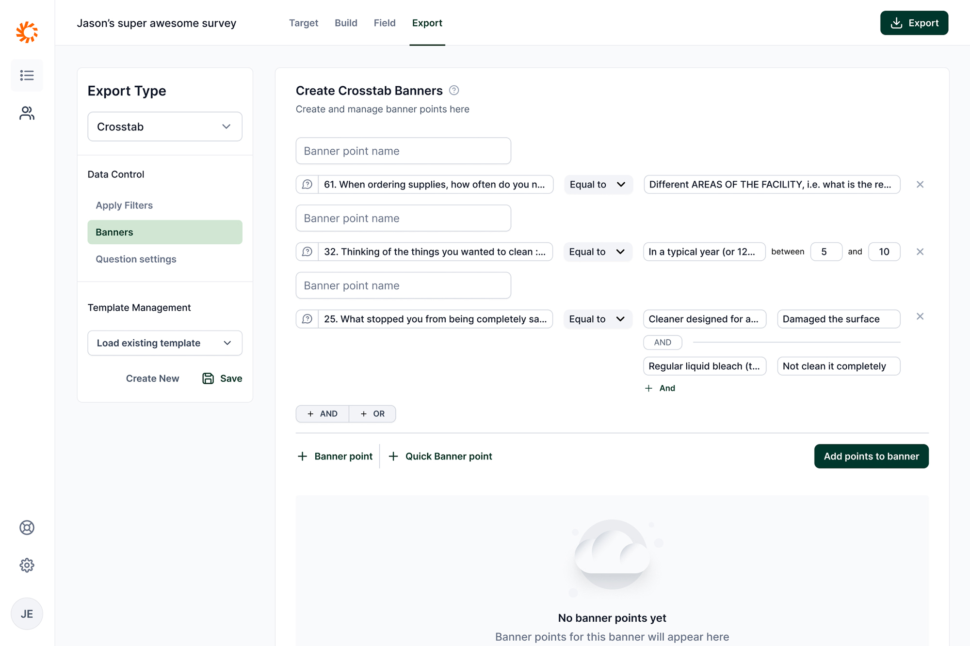 An example of a researcher building a complex banner for export.
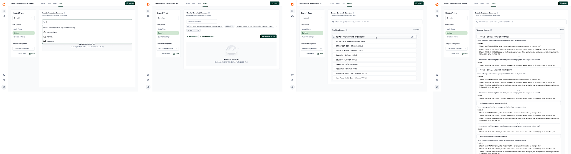 Various states of working with banners and crosstabs.
Reflection
I did not see this project through full implementation, but the design work produced a robust direction for a more scalable export experience.
The project reinforced the value of pairing domain research with structural UI design. Survey data exports are complex because the underlying work is complex. The right interface does not erase that complexity; it organizes it so users can understand what matters, make confident choices, and reuse their work.